
Pearlfisher New York has completed a redesign of the GoMacro brand including the brand identity and packaging graphics for the core MacroBar range - macrobiotic and vegan energy bars.
GoMacro is a family run business of 10 years standing, started after the family decided to embrace a macrobiotic lifestyle. GoMacro felt that there was a lot of sameness and short-term fix associated with the snack and energy bar sector and that there was an opportunity to better position GoMacro as a 'big picture' food and lifestyle brand - tying in with plans to expand the brand portfolio.
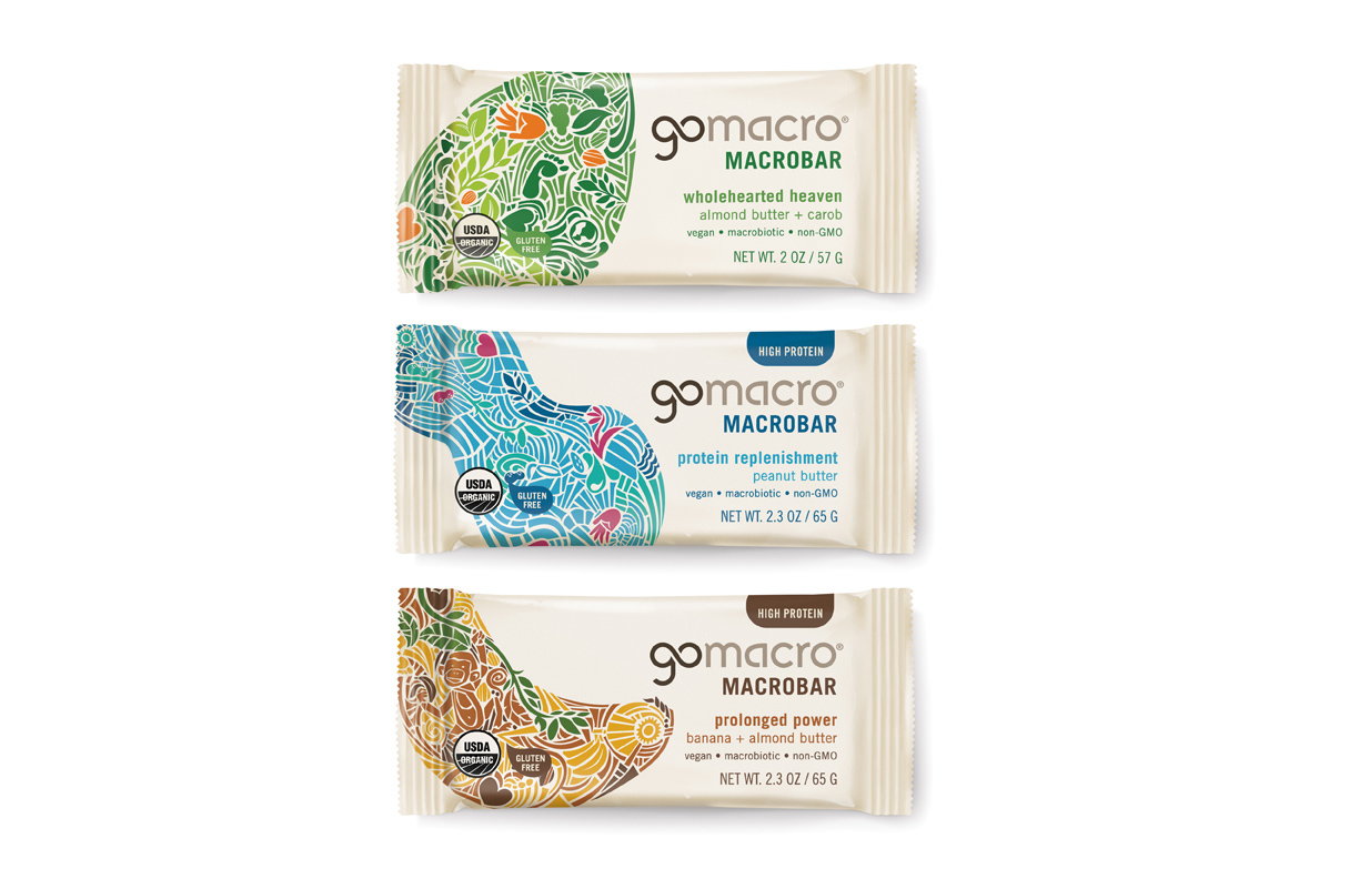
GoMacro encompasses clear values of a living food that is vegan, organic, non-GMO and from sustainable sources. Pearlfisher was tasked with devising a new visual and verbal language to simply and clearly convey this unique philosophy with character and strong messaging - but to also successfully balance the offer of providing the best in personal health with a focus on pleasurable taste. The logo has been refined and contemporized to reflect a modern way of living whilst keeping the emphasis on the call to action "Go Macro."

"We set out to create a Challenger brand that challenges the existing codes of the category and that champions the virtues of the Macrobiotic diet as a naturally rich and vibrant way of life, full of choice and diversity," commented Hamish Campbell, Creative Director at Pearlfisher. "We have developed an ownable iconic secondary language, the mosaic, that allowed us to create appetizing flavor icons that dramatize the principles of this lifestyle."
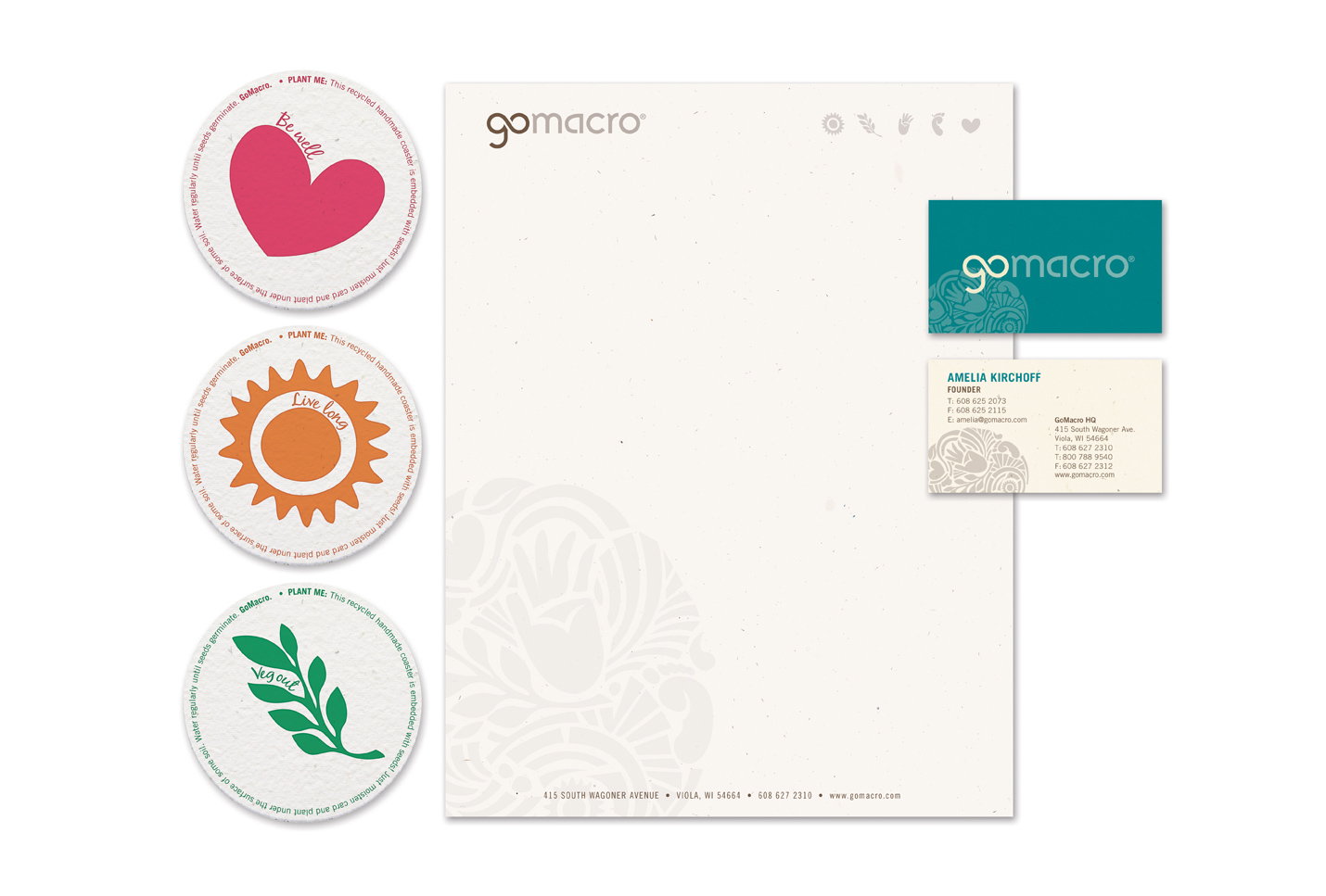
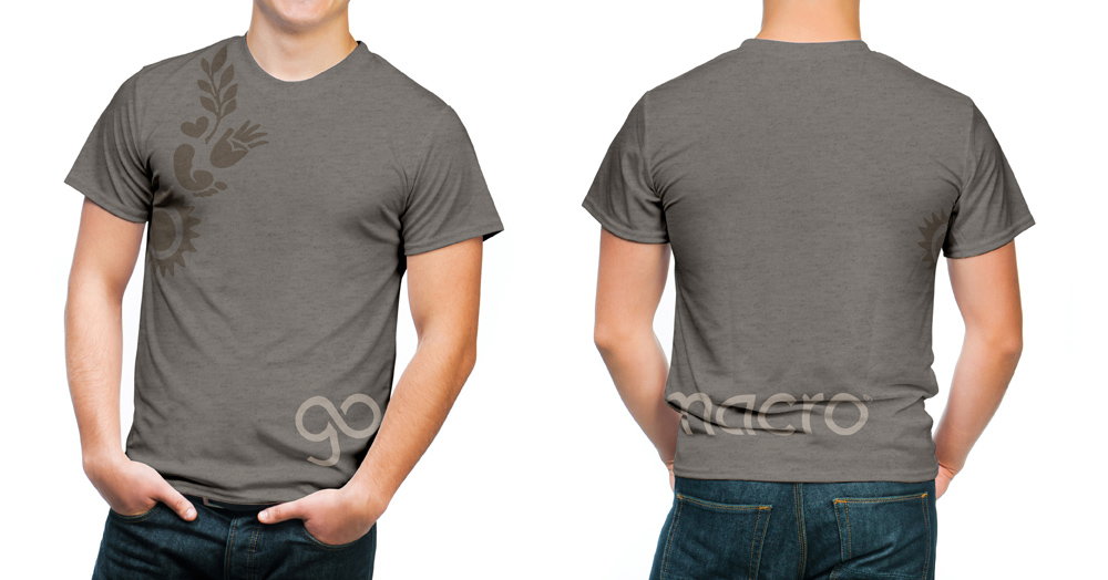
In addition to the core identity and packaging redesign, Pearlfisher has created a range of retail and marketing collateral including the design of tray outers, t-shirts and a set of coasters made out of seeds - which can be planted in their entirety - and which feature the single icons from the new identity to reinforce the multi-layers of the brand message.