
B&B studio has unveiled a new identity for established cereal brand Mornflake's range of oat-based products. With a powerful design that stands out on the supermarket shelf, the rebrand celebrates not only the nutritional benefits of the cereals but also Mornflake's heritage as the fourth-oldest family-owned brand in Britain.
Determined to align the health benefits of oats with Mornflake's longevity as a business, B&B created a new positioning around 'Strength through Oats,' and a new strapline 'Mighty Oats.' A new logo of three shire horses gives visual weight to this message. The imagery is taken from an original illustration drawn from the Mornflake archive, which shows Flossy, Bonnie and Metal - the horses that once pulled the binder that harvested Mornflake's oats back in 1915.
Previously depicted in a more rustic style, this cleaner, contemporary execution symbolises both the brand's heritage and the concept of strength, a core benefit of oats. Its distinctive and vibrant orange hue is drawn from the original Mornflake colour palette to be instantly recognisable to the existing customer base.
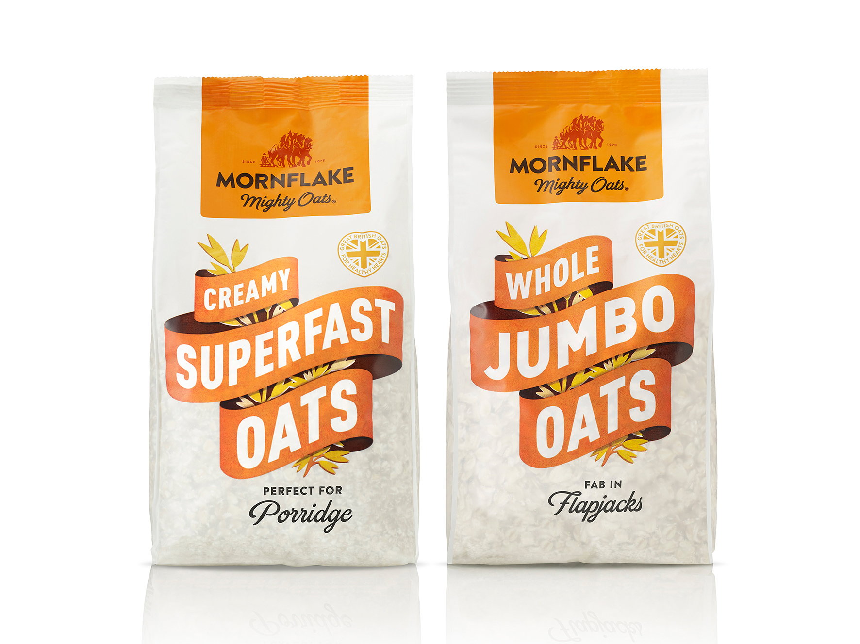
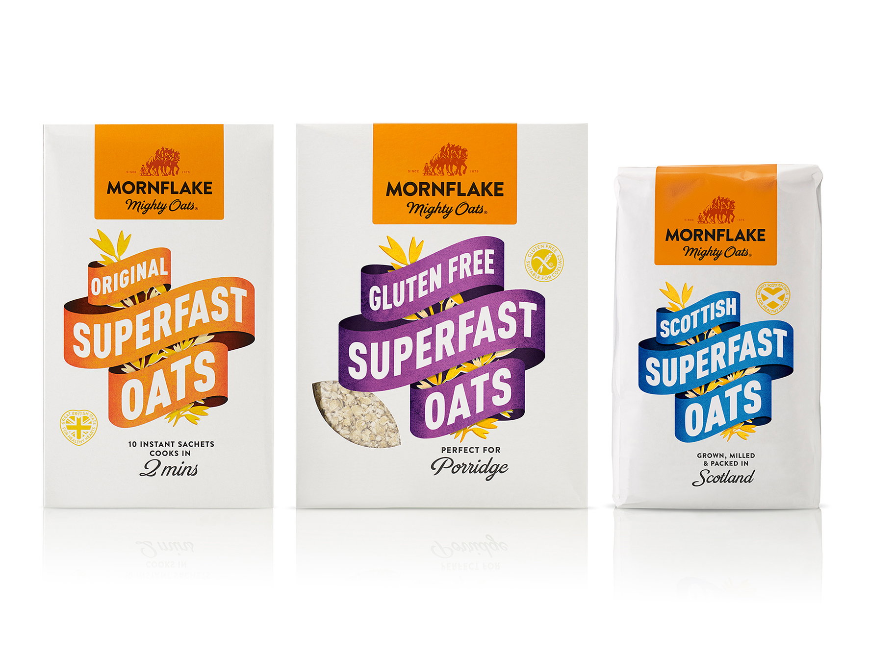
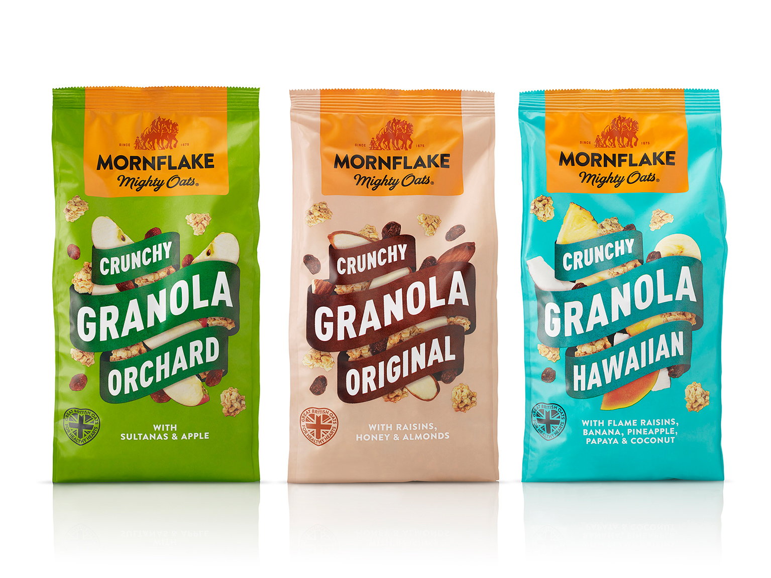
B&B introduced new clarity to the architecture, creating clear ranges around core oats, oat-based products and oatbran products, with tiering within each. The packaging design includes a new dynamic banner device that builds uniformity across the ranges and gives the brand an ownable and recognisable visual language. Classic and premium ranges are differentiated by background, from white and transparent packs featuring colour-coded banners to fully coloured packs.
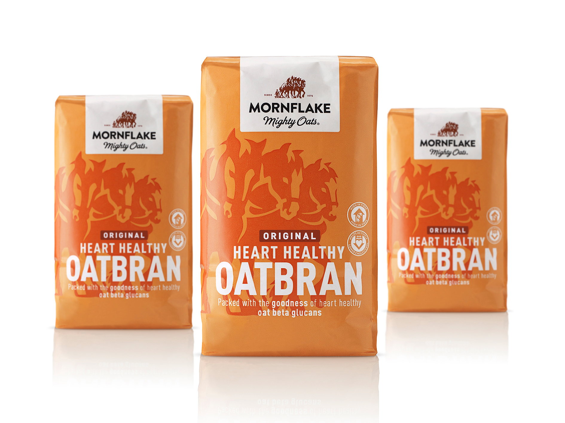
To clearly differentiate the brand's more health-focused oatbran range, which boasts cholesterol-lowering properties, the design features an enlarged, cropped image of the three horses logo to reflect the mightiness of the product within. The visual boldness across all ranges is key to the redesign's standout in the competitive cereal category. In addition, modern typography reinforces the strength and confidence of the brand.
"As one of Britain's oldest brands, Mornflake has a rich history and a great story to tell," commented Shaun Bowen, Creative Partner at B&B studio. "We worked closely with the team to communicate this through a hugely meaningful logo, strong brand equities and clear, consistent brand architecture."